2. Joe Model Batch Run
2026-06-18
Source:vignettes/a02-joe-model-batch-run.Rmd
a02-joe-model-batch-run.RmdOverview
This tutorial demonstrates how to run the Joe Model in batch mode to evaluate multiple management or climate scenarios simultaneously. Building on Tutorial 1: Joe Model Overview, you will learn how to:
- Create and structure a scenarios file
- Run the Joe Model across multiple scenarios in a single function call
- Visualize and compare results across scenarios and locations
Prerequisites
Before starting this tutorial, you should:
- Complete Tutorial 1: Joe Model Overview
- Understand how stressor-response and stressor-magnitude workbooks are structured (see the Data Inputs chapter for detailed format requirements)
- Have basic familiarity with
ggplot2for visualization
Why Use Batch Runs?
In real-world applications, you often need to compare multiple scenarios to inform management decisions. Common use cases include:
| Use Case | Example |
|---|---|
| Climate projections | Compare current conditions vs. 2050 vs. 2080 climate scenarios |
| Recovery actions | Evaluate the benefits of different restoration strategies |
| Sensitivity analysis | Test how changes in specific stressors affect outcomes |
| Risk assessment | Compare best-case, expected, and worst-case scenarios |
Rather than running the Joe Model separately for each scenario and manually combining results, the batch function automates this process and returns a consolidated dataset ready for analysis.
How Batch Runs Work
The batch run function works by modifying stressor magnitudes according to multipliers you specify in a scenarios file:
- Base condition: The original stressor-magnitude values serve as your baseline
- Scenario multipliers: Each scenario specifies which stressors to modify and by how much
- Automatic iteration: The function loops through all scenarios, adjusting stressor values and running the Joe Model
- Consolidated output: Results from all scenarios are combined into a single data frame
For example, a multiplier of 1.2 increases a stressor by
20%, while 0.8 decreases it by 20%.
Understanding the Scenarios File
The scenarios file is a simple Excel workbook (or data frame) that defines what changes to apply in each scenario. It uses a long format where each row specifies a single adjustment — one stressor metric modified by one multiplier within one scenario.
Scenarios File Structure
The scenarios file has four columns:
| Column | Description |
|---|---|
| Scenario | Unique name for the scenario (e.g., “climate_2050”, “restore_riparian”) |
| Stressor | The stressor to modify (must exactly match a name in the stressor-magnitude workbook) |
| Metric | Which property of the stressor to adjust: Mean,
SD, Low_Limit, or Up_Limit
|
| Multiplier | A numeric multiplier applied to the metric: 1.0 = no
change, 1.2 = +20%, 0.5 = -50% |
Key points:
- Each row represents one adjustment to one stressor metric within one scenario
- A single scenario can have multiple rows (adjusting several stressors or metrics)
- You can modify different properties of the same stressor
independently — for example, increase the
Meanof a stressor while also widening its uncertainty by increasingSD - Only stressors you want to change need to appear; all others retain their baseline values
- Stressor names must exactly match the names in your stressor-magnitude workbook
Here is an example of what the scenarios file looks like in Excel:
| Scenario | Stressor | Metric | Multiplier |
|---|---|---|---|
| climate_moderate | Temperature_adult | Mean | 1.10 |
| climate_moderate | Aug_flow | Mean | 0.90 |
| climate_severe | Temperature_adult | Mean | 1.25 |
| climate_severe | Sediment | Mean | 1.20 |
| climate_severe | Aug_flow | Mean | 0.70 |
| restoration | Temperature_adult | Mean | 0.90 |
| restoration | Sediment | Mean | 0.60 |
Reading the Example
The table above defines three scenarios:
| Scenario | What it does |
|---|---|
| climate_moderate | Increases temperature mean by 10% and reduces flow mean by 10% |
| climate_severe | Increases temperature by 25%, sediment by 20%, and reduces flow by 30% |
| restoration | Reduces temperature mean by 10% and sediment mean by 40% (riparian restoration) |
Notice how climate_severe has three rows — one per
stressor adjustment — while restoration has two.
Using the Metric Column
The examples above only modify Mean values, but the
Metric column gives you fine-grained control over how each
stressor’s sampling distribution is altered. Recall that in the
stressor-magnitude workbook, each stressor at each location is defined
by a Mean, SD, Low_Limit, and
Up_Limit. The Metric column lets you target
any of these independently:
| Metric | What it controls | When to use it |
|---|---|---|
| Mean | Central estimate of the stressor value | Shifting baseline conditions (e.g., warming temperatures, reduced flow) |
| SD | Standard deviation of the sampling distribution | Increasing or decreasing uncertainty (e.g., more variable climate) |
| Low_Limit | Lower bound for sampled stressor values | Adjusting the floor of plausible values |
| Up_Limit | Upper bound for sampled stressor values | Adjusting the ceiling of plausible values |
For example, a climate scenario might both increase the mean temperature and widen its variability:
| Scenario | Stressor | Metric | Multiplier |
|---|---|---|---|
| climate_variable | Temperature_adult | Mean | 1.15 |
| climate_variable | Temperature_adult | SD | 1.50 |
In this scenario, the mean temperature at every location is increased by 15%, and the standard deviation is increased by 50% — reflecting both a warmer and more unpredictable climate. Since each metric is a separate row, you can mix and match freely within the same scenario.
Import Data
The batch run requires three input files:
- Stressor-magnitude workbook: Baseline stressor values at each location (see Data Inputs for format details)
- Stressor-response workbook: Dose-response relationships for each stressor (see Stressor-Response Functions for guidance on developing these)
- Scenarios file: Multipliers defining each scenario (see above)
# ---------------------------------------------------------
# 1. Import stressor-magnitude workbook
#    This contains the baseline stressor values at each location
# ---------------------------------------------------------
filename_sm <- system.file("extdata", "stressor_magnitude_unc_ARTR.xlsx", package = "CEMPRA")
stressor_magnitude <- StressorMagnitudeWorkbook(
  filename = filename_sm,
  scenario_worksheet = "natural_unc"
)

# ---------------------------------------------------------
# 2. Import stressor-response workbook
#    This defines how each stressor affects system capacity
# ---------------------------------------------------------
filename_sr <- system.file("extdata", "stressor_response_fixed_ARTR.xlsx", package = "CEMPRA")
stressor_response <- StressorResponseWorkbook(filename = filename_sr)

# ---------------------------------------------------------
# 3. Import the scenarios file
#    This defines the multipliers for each scenario
# ---------------------------------------------------------
filename_sc <- system.file("extdata", "scenario_batch_joe.xlsx", package = "CEMPRA")
scenarios <- readxl::read_excel(filename_sc)
Let’s examine the scenarios file to understand what scenarios we’re comparing:
# View the scenarios configuration
print(scenarios)
#> # A tibble: 8 × 4
#>   Scenario   Stressor          Metric Multiplier
#>   <chr>      <chr>             <chr>       <dbl>
#> 1 scenario_1 Temperature_adult Mean          1.2
#> 2 scenario_1 Temperature_adult SD            1.1
#> 3 scenario_2 Aug_flow          Mean          0.7
#> 4 scenario_2 Aug_flow          SD            1.1
#> 5 scenario_3 Nat_lim_other     Mean          0.5
#> 6 scenario_4 Temperature_adult Mean          0.8
#> 7 scenario_4 Nat_lim_other     Mean          0.8
#> 8 scenario_4 Aug_flow          Mean          0.8
Run the Joe Model in Batch Mode
Now we run the Joe Model across all scenarios. The
JoeModel_Run_Batch() function:
- Reads the baseline stressor magnitudes
- For each scenario, applies the specified multipliers to adjust stressor values
- Runs the Joe Model with Monte Carlo simulation
- Combines all results into a single data frame
A note on reproducibility: Batch runs involve Monte Carlo simulation for every scenario, so results will differ between runs. Setting a random seed ensures your results are reproducible — useful for debugging, reporting, or verifying that your setup produces the expected output.
# Set seed for reproducible results across all scenarios
set.seed(42)

# Run the Joe Model in batch mode across all scenarios
# Note: MC_sims is set low (3) for this tutorial - use higher values (100+)
# for real applications to get stable uncertainty estimates
exp_dat <- JoeModel_Run_Batch(
  scenarios = scenarios,           # Scenario definitions with multipliers
  dose = stressor_magnitude,       # Baseline stressor magnitudes
  sr_wb_dat = stressor_response,   # Stressor-response relationships
  MC_sims = 3                      # Number of Monte Carlo simulations per scenario
)
Understanding the Output
The output exp_dat is a data frame with one row per
location × scenario × Monte Carlo replicate:
# View the first few rows of results
head(exp_dat, 6)
#> # A tibble: 6 × 4
#> # Groups:   HUC, simulation [6]
#>          HUC simulation    CE Scenario
#>        <int>      <int> <dbl> <chr>
#> 1 1701010201          1 0     scenario_1
#> 2 1701010201          2 0     scenario_1
#> 3 1701010201          3 0     scenario_1
#> 4 1701010202          1 0.337 scenario_1
#> 5 1701010202          2 0.365 scenario_1
#> 6 1701010202          3 0.657 scenario_1

# Check the dimensions
cat("\nTotal rows:", nrow(exp_dat), "\n")
#>
#> Total rows: 1236
cat("Unique scenarios:", length(unique(exp_dat$Scenario)), "\n")
#> Unique scenarios: 4
cat("Unique locations (HUCs):", length(unique(exp_dat$HUC)), "\n")
#> Unique locations (HUCs): 103| Column | Description |
|---|---|
| HUC | Location identifier (Hydrologic Unit Code or custom ID) |
| Scenario | Which scenario this result belongs to |
| simulation | Monte Carlo replicate number |
| CE | Cumulative Effects score (System Capacity, 0-1 scale) |
Visualizing Results
With batch results, there are two natural ways to visualize the data:
- By location: Compare all scenarios for a single watershed
- By scenario: Compare all watersheds within a single scenario
Interpreting System Capacity Scores
Before plotting, it’s helpful to understand how to interpret system capacity values. Change these for your own study stystem:
| Score Range | Interpretation | Color Code |
|---|---|---|
| 0.75 - 1.00 | Good: High habitat capacity, minimal cumulative stress | Green |
| 0.50 - 0.75 | Moderate: Some degradation, recovery actions may help | Yellow |
| 0.20 - 0.50 | Poor: Significant stress, likely population impacts | Orange |
| 0.00 - 0.20 | Critical: Severe degradation, urgent action needed | Pink/Red |
These thresholds are general guidelines; appropriate thresholds may vary by species and system.
Plot 1: Compare Scenarios for a Single Location
This visualization answers: “How do different scenarios affect system capacity at a specific watershed?”
This is useful for:
- Presenting results to local stakeholders
- Evaluating which recovery actions would benefit a priority watershed
- Comparing climate impact projections for a specific location
# ---------------------------------------------------------
# Select a single watershed to visualize
# Replace this HUC with one relevant to your study area
# ---------------------------------------------------------
target_huc <- 1701010204
huc_subset <- exp_dat[exp_dat$HUC == target_huc, ]

# ---------------------------------------------------------
# Calculate summary statistics across Monte Carlo replicates
# Mean gives the central estimate; SD shows uncertainty
# ---------------------------------------------------------
huc_summary <- huc_subset %>%
  group_by(Scenario) %>%
  summarise(
    mean = mean(CE, na.rm = TRUE),
    sd = sd(CE, na.rm = TRUE),
    .groups = "drop"
  ) %>%
  mutate(
    lower = mean - sd,
    upper = mean + sd
  )

# ---------------------------------------------------------
# Create the plot with color-coded capacity zones
# ---------------------------------------------------------
ggplot(huc_summary, aes(x = mean, y = Scenario, xmin = lower, xmax = upper)) +
  # Add background zones for capacity interpretation
  geom_rect(aes(xmin = 0, xmax = 0.2, ymin = -Inf, ymax = Inf),
            fill = "pink", alpha = 0.02) +
  geom_rect(aes(xmin = 0.2, xmax = 0.5, ymin = -Inf, ymax = Inf),
            fill = "orange", alpha = 0.02) +
  geom_rect(aes(xmin = 0.5, xmax = 0.75, ymin = -Inf, ymax = Inf),
            fill = "yellow", alpha = 0.02) +
  geom_rect(aes(xmin = 0.75, xmax = 1, ymin = -Inf, ymax = Inf),
            fill = "green", alpha = 0.02) +
  # Add points and error bars
  geom_point(size = 3) +
  geom_errorbarh(height = 0.2) +
  # Labels and styling
  ggtitle(paste("Watershed:", target_huc)) +
  xlab("System Capacity (0 - 1)") +
  ylab("Scenario") +
  scale_x_continuous(limits = c(0, 1)) +
  theme_bw() +
  theme(
    plot.title = element_text(hjust = 0.5),
    panel.grid.minor = element_blank()
  )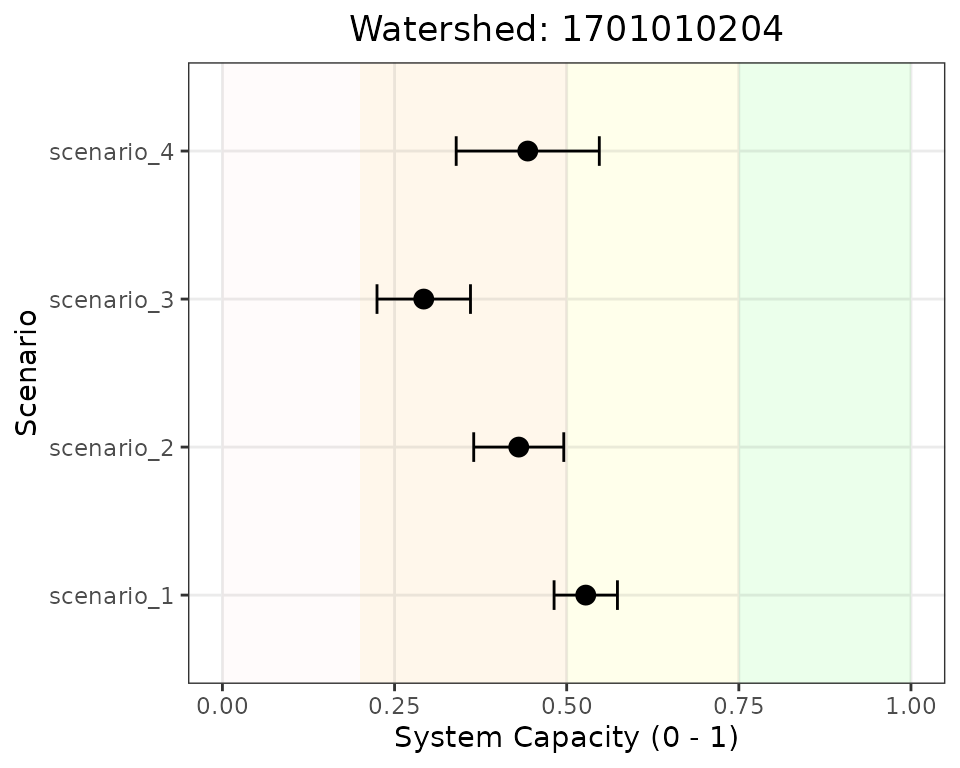
System capacity across scenarios for a single watershed. Error bars show standard deviation from Monte Carlo simulations.
Reading this plot: - Each point shows the mean system capacity for that scenario - Error bars indicate uncertainty (±1 standard deviation from Monte Carlo simulation) - Background colors indicate capacity zones (green = good, pink = critical) - Scenarios can be compared by their horizontal position and overlap
Plot 2: Compare Locations Within a Single Scenario
This visualization answers: “Which watersheds are most/least affected under a given scenario?”
This is useful for:
- Prioritizing locations for management action
- Identifying spatial patterns of vulnerability
- Reporting landscape-wide results for a specific scenario
# ---------------------------------------------------------
# Select a single scenario to visualize
# ---------------------------------------------------------
target_scenario <- "scenario_1"
scenario_subset <- exp_dat[exp_dat$Scenario == target_scenario, ]

# ---------------------------------------------------------
# Calculate summary statistics for each watershed
# ---------------------------------------------------------
scenario_summary <- scenario_subset %>%
  group_by(HUC) %>%
  summarise(
    mean = mean(CE, na.rm = TRUE),
    sd = sd(CE, na.rm = TRUE),
    .groups = "drop"
  ) %>%
  mutate(
    lower = mean - sd,
    upper = mean + sd,
    HUC = as.character(HUC)  # Convert to character for proper y-axis display
  ) %>%
  # Sort by mean capacity for easier interpretation
  arrange(desc(mean))

# Reorder factor levels for sorted display
scenario_summary$HUC <- factor(scenario_summary$HUC, levels = rev(scenario_summary$HUC))

# ---------------------------------------------------------
# Create the plot
# ---------------------------------------------------------
ggplot(scenario_summary, aes(x = mean, y = HUC, xmin = lower, xmax = upper)) +
  # Add background zones
  geom_rect(aes(xmin = 0, xmax = 0.2, ymin = -Inf, ymax = Inf),
            fill = "pink", alpha = 0.02) +
  geom_rect(aes(xmin = 0.2, xmax = 0.5, ymin = -Inf, ymax = Inf),
            fill = "orange", alpha = 0.02) +
  geom_rect(aes(xmin = 0.5, xmax = 0.75, ymin = -Inf, ymax = Inf),
            fill = "yellow", alpha = 0.02) +
  geom_rect(aes(xmin = 0.75, xmax = 1, ymin = -Inf, ymax = Inf),
            fill = "green", alpha = 0.02) +
  # Add points and error bars
  geom_point(size = 2) +
  geom_errorbarh(height = 0.3) +
  # Labels and styling
  ggtitle(paste("Scenario:", target_scenario)) +
  xlab("System Capacity (0 - 1)") +
  ylab("Watershed (HUC)") +
  scale_x_continuous(limits = c(0, 1)) +
  theme_bw() +
  theme(
    plot.title = element_text(hjust = 0.5),
    panel.grid.minor = element_blank(),
    axis.text.y = element_text(size = 7)  # Smaller text for many watersheds
  )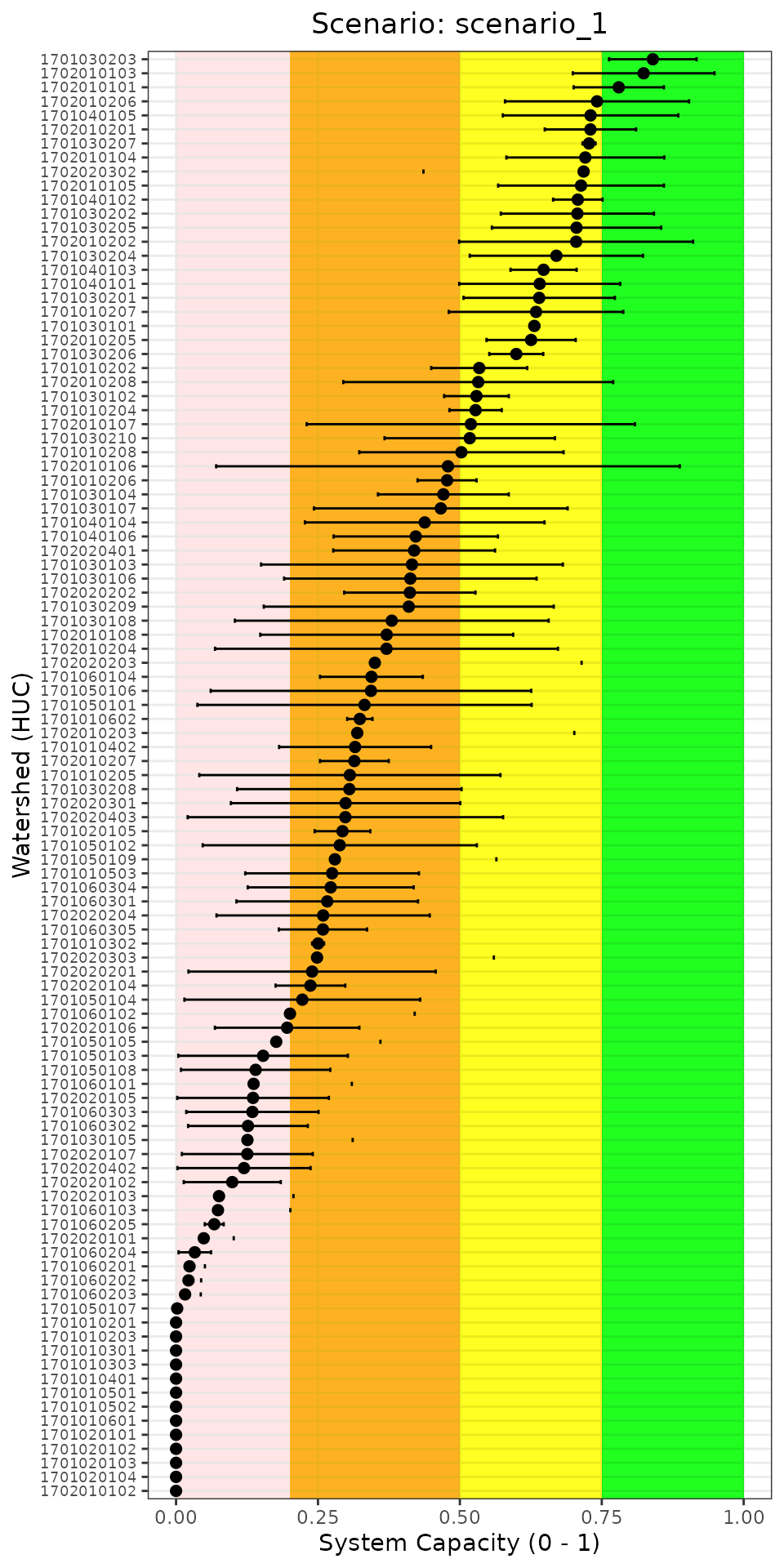
System capacity across all watersheds for a single scenario. This view helps identify which locations are most vulnerable.
Reading this plot: - Watersheds are sorted from highest to lowest capacity (top to bottom) - Watersheds in the pink/orange zones may be priorities for restoration - Wide error bars indicate high uncertainty, possibly due to variable stressor data
Advanced: Comparing Scenario Differences
Beyond visualizing raw scores, you may want to quantify how much each scenario changes capacity relative to baseline. This helps identify which scenarios have the largest positive or negative impact.
# ---------------------------------------------------------
# Calculate mean capacity per scenario (across all locations)
# ---------------------------------------------------------
scenario_means <- exp_dat %>%
  group_by(Scenario) %>%
  summarise(
    mean_capacity = mean(CE, na.rm = TRUE),
    sd_capacity = sd(CE, na.rm = TRUE),
    min_capacity = min(CE, na.rm = TRUE),
    max_capacity = max(CE, na.rm = TRUE),
    .groups = "drop"
  ) %>%
  arrange(desc(mean_capacity))

print(scenario_means)
#> # A tibble: 4 × 5
#>   Scenario   mean_capacity sd_capacity min_capacity max_capacity
#>   <chr>              <dbl>       <dbl>        <dbl>        <dbl>
#> 1 scenario_2         0.330       0.226            0        0.789
#> 2 scenario_1         0.325       0.277            0        0.977
#> 3 scenario_4         0.300       0.208            0        0.736
#> 4 scenario_3         0.213       0.178            0        0.721
This summary table shows:
- mean_capacity: Average system capacity across all locations and Monte Carlo runs
- sd_capacity: Variability in capacity scores
- min/max_capacity: The range of outcomes observed
Saving Results for Further Analysis
You can export the batch results for use in other analyses or reporting:
# ---------------------------------------------------------
# Export full results to CSV
# ---------------------------------------------------------
write.csv(exp_dat, "joe_model_batch_results.csv", row.names = FALSE)

# ---------------------------------------------------------
# Export scenario summary statistics
# ---------------------------------------------------------
write.csv(scenario_means, "scenario_summary.csv", row.names = FALSE)
Tips for Your Application
Choosing Multiplier Values
When creating your scenarios file, consider:
- Use empirical data when available: Climate projections, monitoring data, or modeled outputs provide defensible multipliers
- Document your assumptions: Record the rationale for each multiplier value
- Test sensitivity: Try a range of multipliers to understand how sensitive results are to your assumptions
- Consider interactions: A scenario with multiple stressor changes may have non-linear cumulative effects
Increasing Monte Carlo Simulations
For publication or decision-making, increase MC_sims to
get stable estimates:
# Recommended: 100+ simulations for stable uncertainty estimates
exp_dat <- JoeModel_Run_Batch(
  scenarios = scenarios,
  dose = stressor_magnitude,
  sr_wb_dat = stressor_response,
  MC_sims = 100  # Increase for real applications
)Next Steps
Now that you can run batch scenarios with the Joe Model, consider:
| Tutorial | Description |
|---|---|
| 3. Population Model Overview | Link system capacity to population dynamics |
| 4. Population Model Batch Run | Run population projections across scenarios |
| 5. Population Model Evaluation | Sensitivity analysis and model evaluation |
For additional guidance, see the CEMPRA Documentation, including:
- Case Study Applications — real-world examples with scenario comparisons for species like Athabasca Rainbow Trout and Nooksack Dace
- R Shiny App Guide — interactive scenario exploration without writing R code